
Design by Jennifer Gilmer in Washington, DC
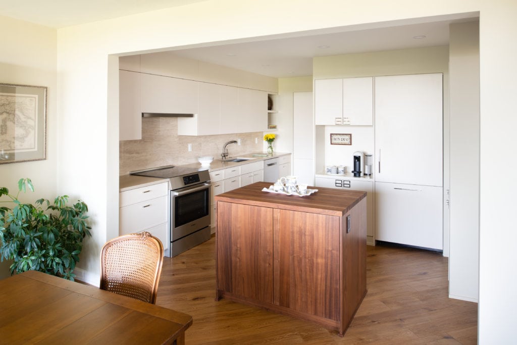
The original kitchen was isolated from the rest of the condo. Soffits were everywhere, closing in the space. The door into the kitchen is on an angle so the original design used this as a design statement with an angled corner wall cabinet and a very large angled pantry in one corner. Our goal was to create a more open feeling by taking down most of the wall between the dining room and the kitchen, by removing as many soffits as possible, and by eliminating all angles. Not only do these take up physical space, but they also eat up visual space.
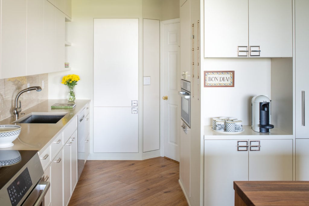
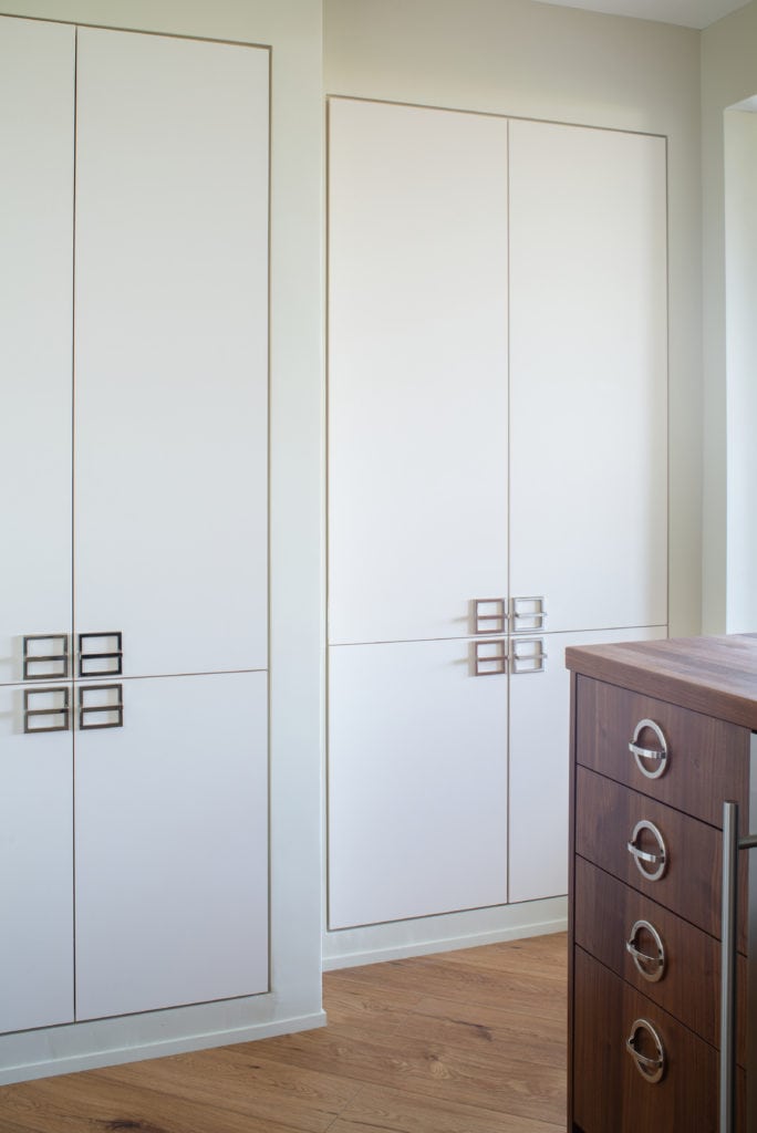
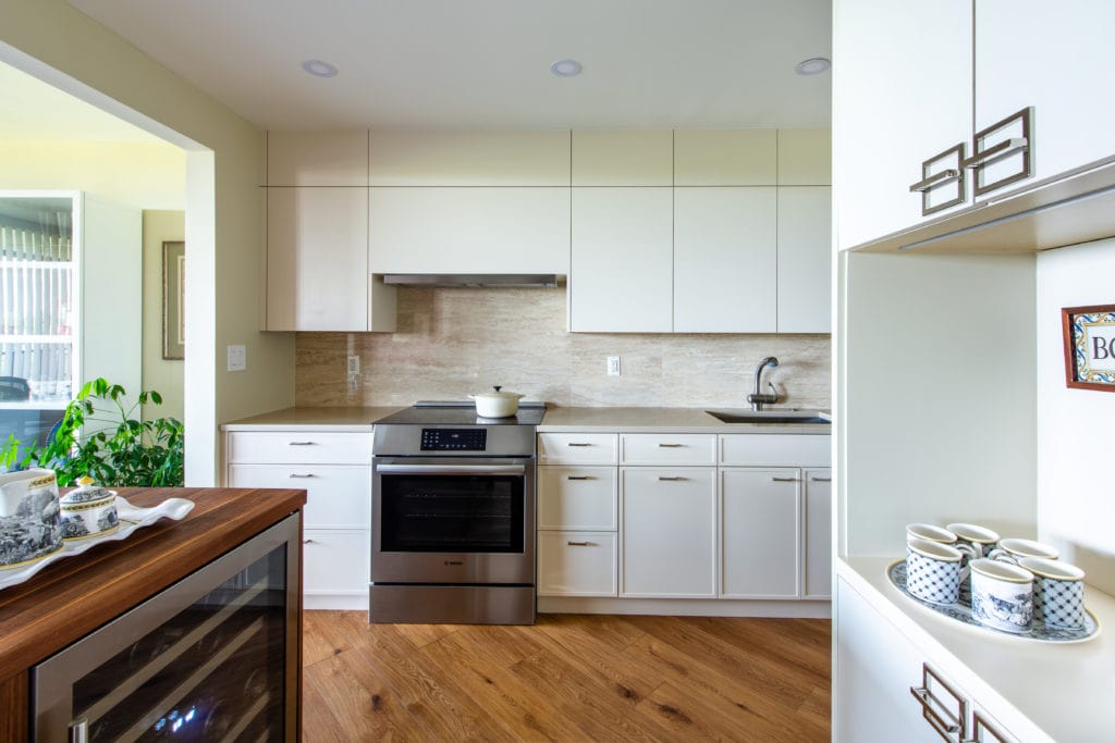
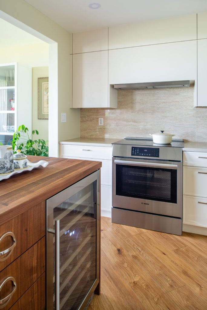
The corner pantry came out easily. We were able to remove the wall between the kitchen and dining room and it turned out that there were several soffits that we couldn’t remove. We had to keep the soffit above the sink and range wall but modified it slightly so that we could add door panels to help to disguise it. This also helped to make the room seem larger, giving the illusion of taller ceilings. The other soffits were on the refrigerator side so we held the tall cabinets down and built walls around them.
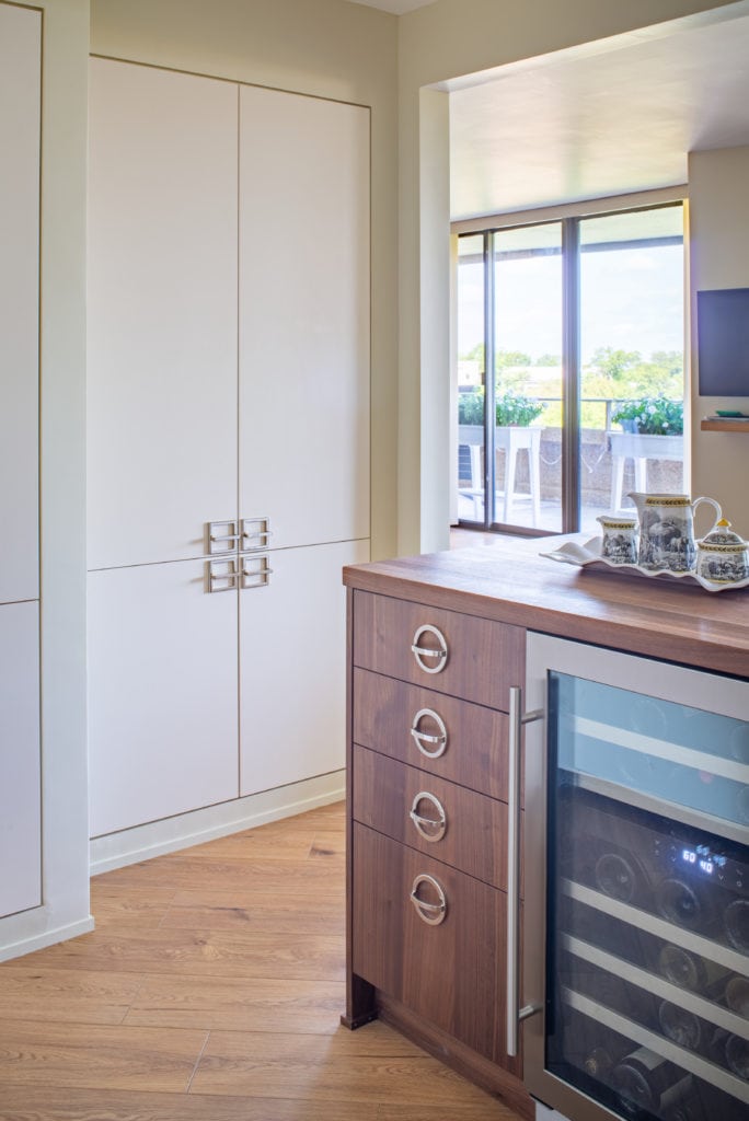
Taking out the wall gave us much more room in the kitchen and allowed us to design a small island that houses the wine cooler. Because the client had more traditional furniture but wanted a more contemporary kitchen, we decided to make the island out of walnut. This warmed up the kitchen but also because it was so exposed to the rest of the condo, it felt more like furniture rather than kitchen cabinets, blending well with the client’s existing furniture and creating a nice transition from the living to the kitchen spaces.
We were limited to moving the mechanicals since this is a condo so the gas range and the sink had to remain close to their original positions. We were able to space the sink a bit farther away from the range to allow adequate counter space by moving the refrigerator to the other side of the kitchen. We determined the location of the sink based on the rhythm of wall cabinets, centering it under four 21” wide doors. We felt that having a conventional hood would be too disruptive so we opted for a Bosch slide-out hood that fit into a cabinet above the range.
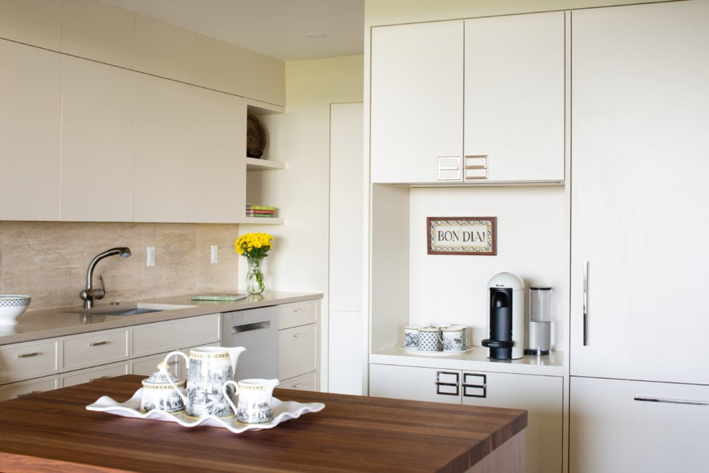
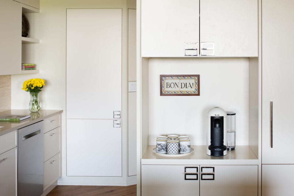
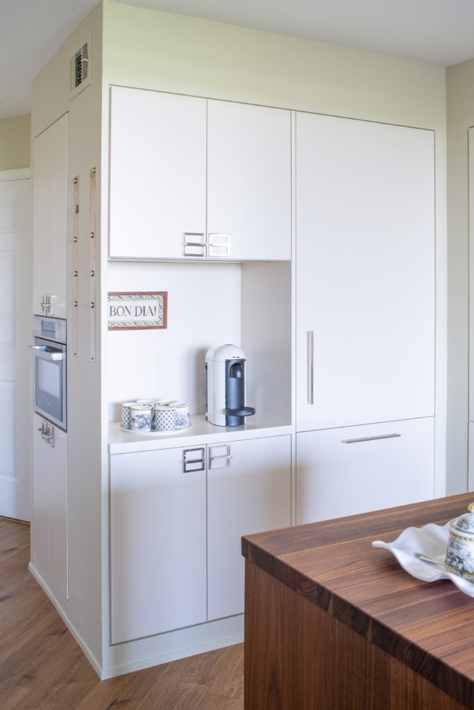
We convinced the client that using a fully integrated refrigerator was absolutely necessary in order to attain a successful design. We surrounded the refrigerator with tall cabinets and drywalled around them, not only to hide the soffits above but also to hide a wall that had to remain. The client wanted to have a special space for her espresso machine so we opened up an area to the left of the refrigerator which gave her ample room, not far from the sink.
She needed a microwave so we suggested using the Bosch speed oven which would also double as a second oven. We were able to fit just the right size tall cabinet behind the espresso center to house the speed oven.
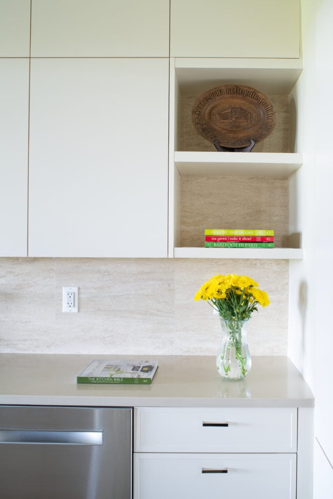
The door style for the base cabinets on the sink wall has a very narrow frame around them, helping the kitchen to fit into a more traditional space. We opted to use flat doors for the wall and tall cabinets in order to keep the space calm at eye level.
All of these design elements helped to make this kitchen feel twice as big. It was an amazing transformation!


